Overview
When evaluating a text embedding model, the obvious approach is to run a supervised downstream task — train a classifier, measure F1, repeat. But labels are expensive. Can we instead look at the geometry of the embedding space to predict which model will perform best?
This post summarises a four-part analysis of five embedding models on the BiaSWE dataset (a Swedish hate-speech and misogyny corpus), covering:
- What the space looks like — 2-D projections of the raw embedding geometry
- Geometrical metrics — pairwise similarity distributions and hubness
- Clustering — unsupervised cluster agreement and bootstrap stability
- Classification — supervised downstream performance (the ground truth)
- Does any of it correlate? — the central question
The Setup
Models Under Test
| Model | Embedding Dim |
|---|---|
qwen_0.6b | 1 024 |
qwen_4b | 2 560 |
nomic | 768 |
kalm_v1 | 896 |
kalm_v2.5 | 896 |
Dataset — BiaSWE
450 Swedish social-media texts annotated by up to four human annotators for hate speech and misogyny. Labels are collapsed into a four-class scheme via majority vote:
| Class | Count | Share |
|---|---|---|
hate_and_misogyny | 182 | 40.4 % |
no_bias | 168 | 37.3 % |
misogyny_only | 47 | 10.4 % |
hate_only | 42 | 9.3 % |
unclear | 11 | 2.4 % |
Mean inter-annotator agreement is 0.904 (fraction of annotators agreeing on the hate-speech label per item), with 74.2 % of texts reaching full consensus.
To make the task concrete, here is one representative text per class (Swedish social-media posts; agreement score shown in brackets):
| Class | Agreement | Example (truncated) |
|---|---|---|
hate_and_misogyny | 100 % | Är singeltjejer med 180-sängar slampor?: En vana som jag har fått när jag är på… |
hate_only | 100 % | Kulturberikare i Skåne: Jag funderar på att flytta till det lilla samhället Blentarp utanför Sjöbo… |
misogyny_only | 75 % | Manshatande man?: Ok till att börja med ska sägas att jag är en heterosexuell man,… |
no_bias | 100 % | Juridiska möjligheter att förhindra byggandet av fula bostäder?: Hur kan jag med juridiska styrmedel förhindra… |
unclear | 50 % | Ni som bor i hyreslägenhet! Varför i helvete gör ni det? Inte råd?: Hej! Tycker… |
The misogyny_only and unclear classes have no fully unanimous examples — a reflection of the genuine ambiguity in annotating subtle misogyny and borderline content. The low count of unclear (11 texts) and its 50 % maximum agreement confirm that these cases are genuinely contested; they are excluded from the downstream classification task.
Step 1 — What the Space Actually Looks Like
Before any numbers, let’s look at the raw geometry. We project each model’s 450 embeddings into 2-D using three methods — PCA, t-SNE, and UMAP — and overlay the 10 nearest neighbours of six randomly chosen anchor points (stars). Lines connect each anchor to its neighbourhood in high-dimensional space; if the projection is faithful, those lines stay short and local.
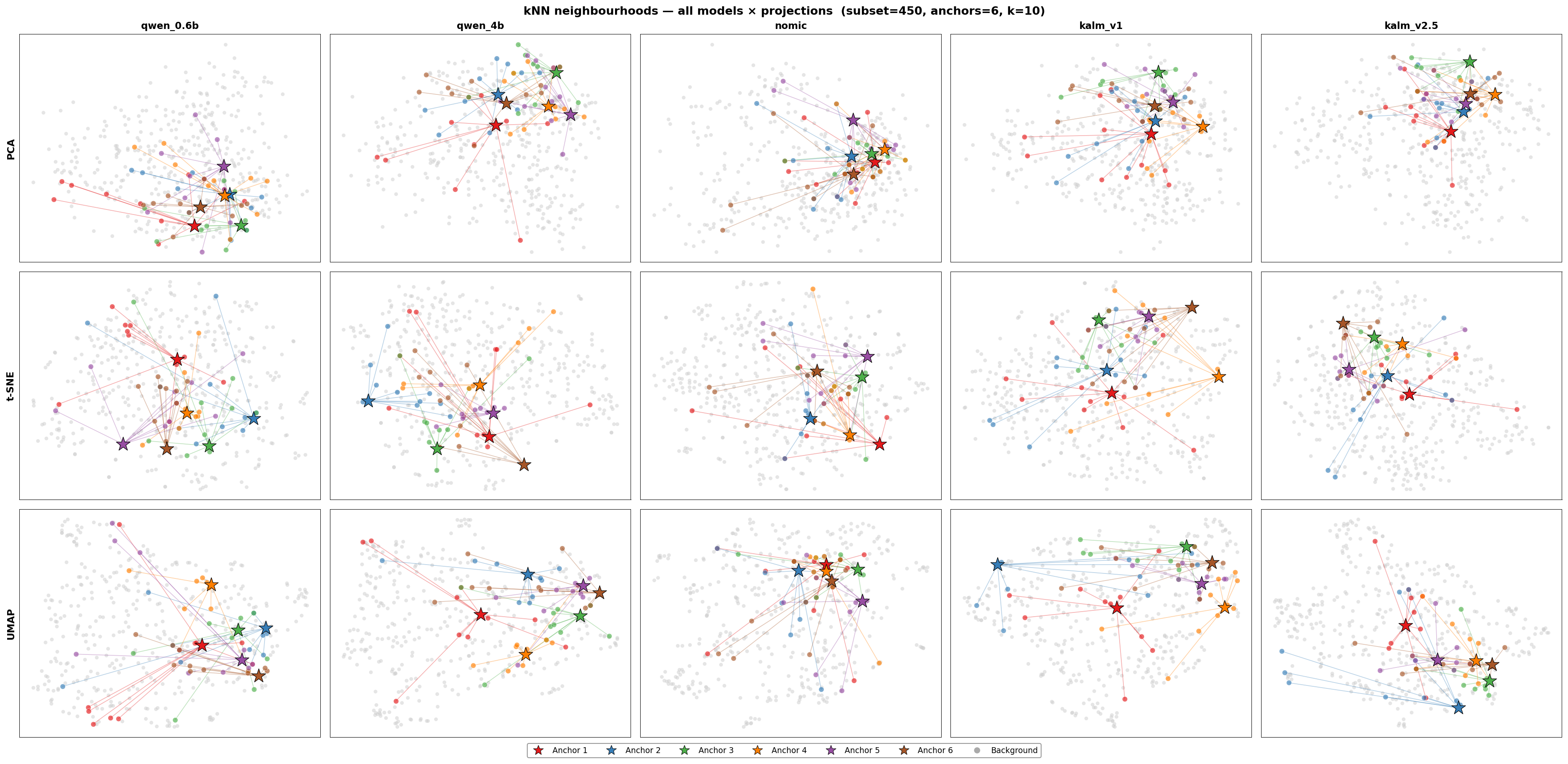
2-D projections of all five embedding models. Rows: PCA, t-SNE, UMAP. Columns: qwen_0.6b, qwen_4b, nomic, kalm_v1, kalm_v2.5. Stars mark anchor points; coloured lines connect each anchor to its 10 nearest neighbours in the original high-dimensional space.
A few things jump out immediately:
kalm_v2.5packs points into a very tight region. Anchor neighbourhoods overlap heavily — there is little room between different texts.nomicalso clusters tightly, but with a few stray outliers pulling anchor lines across the whole plot.qwen_0.6bandqwen_4bspread out more, and anchor neighbourhoods stay more local and compact.kalm_v1sits between the extremes — moderate spread, reasonable neighbourhood coherence.
A necessary caveat: projections can mislead
2-D projections compress hundreds or thousands of dimensions into two. What looks “spread out” in t-SNE may still be a compressed ball in the original space, and vice versa. We can measure how faithfully each projection preserves neighbourhoods by computing the fraction of a point’s true top-10 high-dimensional neighbours that are also its top-10 neighbours in 2-D:
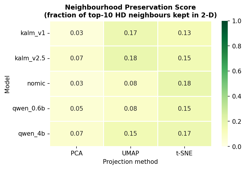
Neighbourhood preservation score (fraction of top-10 HD neighbours kept in 2-D). Higher = the projection is more trustworthy.
Across all models and methods, scores sit between 0.12 and 0.40 — meaning the 2-D pictures are losing 60–88 % of the true neighbourhood structure. The qualitative impressions above are real signals, but they can’t be trusted as precise measurements. That’s why we need the numbers.
Step 2 — Geometrical Metrics
2.1 Similarity Distribution
For each model we compute all (\binom{N}{2}) pairwise cosine similarities between the 450 embeddings.
$$ \cos(\mathbf{u}, \mathbf{v}) = \frac{\mathbf{u} \cdot \mathbf{v}}{|\mathbf{u}| |\mathbf{v}|} $$
A healthy embedding space shows a spread-out distribution — different texts should land at different distances. A distribution compressed near 1.0 means the model is projecting nearly everything into the same region, leaving little discriminative signal.
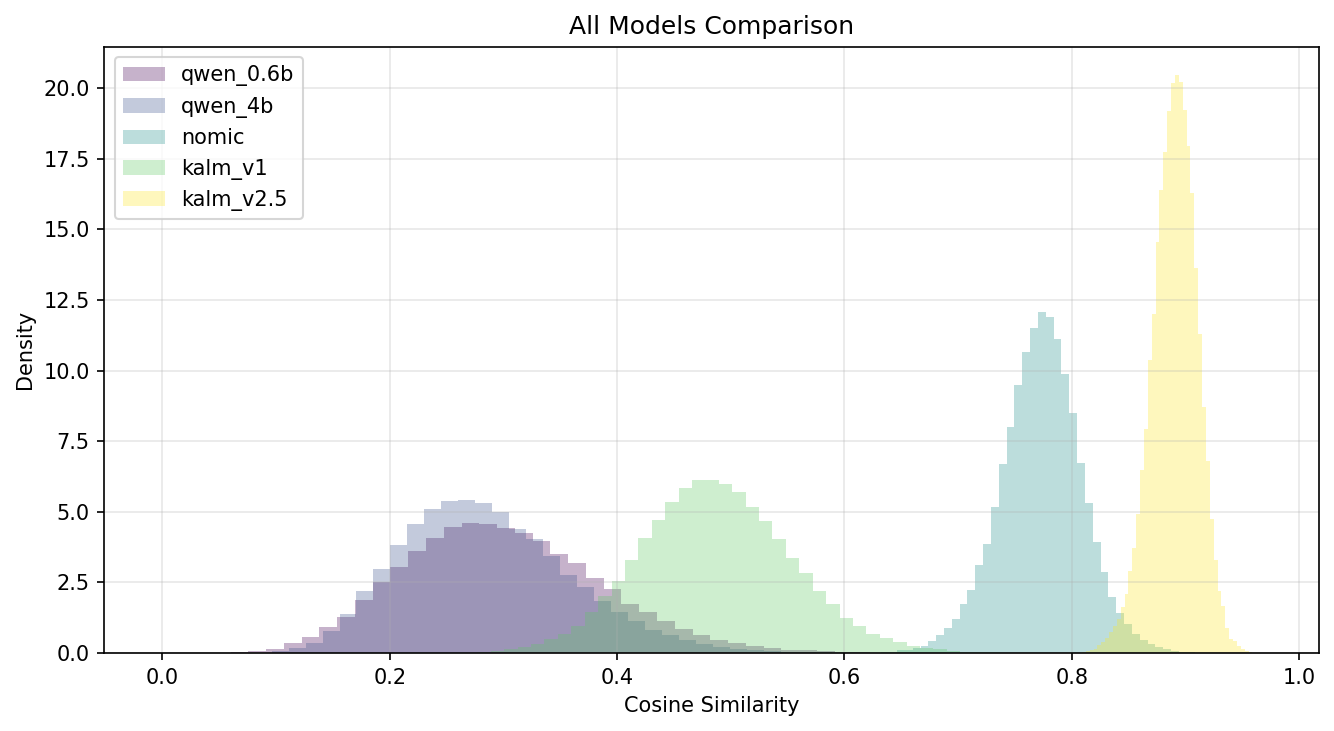
Pairwise cosine-similarity distributions for all five models.
| Model | Mean | Std | Skewness |
|---|---|---|---|
qwen_0.6b | 0.299 | 0.087 | 0.38 |
qwen_4b | 0.286 | 0.075 | 0.56 |
nomic | 0.773 | 0.036 | −0.10 |
kalm_v1 | 0.487 | 0.066 | 0.18 |
kalm_v2.5 | 0.890 | 0.020 | −0.26 |
The chart confirms what the projections hinted: kalm_v2.5 is a spike near 0.90 (std 0.02) and nomic a spike near 0.77 (std 0.04). The Qwen models are the only ones with genuinely spread-out similarity distributions — which is exactly what you’d want for a classifier to grab onto.
2.2 Hubness
Hubness is a well-known pathology of high-dimensional spaces. Some points — hubs — become the nearest neighbour of many other points, while anti-hubs are near nobody. This skewed neighbourhood structure hurts distance-based retrieval and classification.
Before looking at the numbers, the projections below offer a geometric intuition. Each panel shows one model’s 450 embeddings projected to 2-D, with six randomly chosen anchor points (stars) connected by lines to their 10 nearest neighbours in the original high-dimensional space. Short, tightly bundled lines mean the model’s neighbourhood structure is healthy and local. Long lines that cross the plot — especially lines from many different anchors converging on the same small region — are a visual signature of hub formation.
Rows: PCA, t-SNE, UMAP. Columns: all five models. Stars are anchor points; coloured lines connect each anchor to its 10 nearest neighbours in high-dimensional space. Short, local lines indicate well-structured neighbourhoods; long crossing lines indicate hub points attracting neighbourhood assignments from across the space.
Notice how nomic (second column) consistently shows anchor lines that stretch across the full plot — a direct geometric signature of the hubness pathology we will quantify below. The Qwen models, by contrast, keep their anchor lines compact and local across all three projection methods.
For a fixed (k), let (N_k(i)) count how many other points list point (i) among their (k) nearest neighbours:
$$ S_k = \frac{\mathbb{E}[(N_k - k)^3]}{\mathbb{E}[(N_k - k)^2]^{3/2}} $$
(S_k \approx 0) is ideal; (S_k \gg 0) signals pathological hubs.
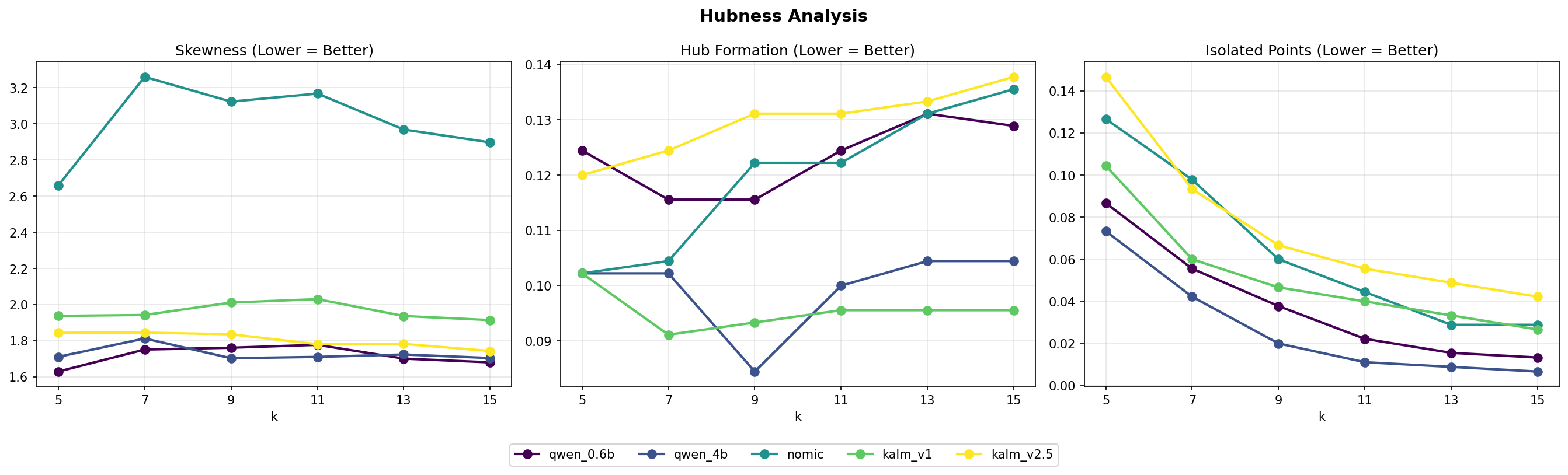
Hubness skewness, hub-formation rate and isolated-point rate as k varies from 5 to 15. Lower is better for all three panels.
| Model | Skewness | Hubs % | Anti-Hubs % |
|---|---|---|---|
qwen_0.6b | 1.72 | 12.3 % | 3.9 % |
qwen_4b | 1.73 | 10.0 % | 2.7 % |
nomic | 3.01 ⚠️ | 12.0 % | 6.4 % |
kalm_v1 | 1.96 | 9.6 % | 5.2 % |
kalm_v2.5 | 1.81 | 13.0 % | 7.6 % |
nomic’s skewness of 3.01 is roughly 1.7× worse than any other model. Its tight similarity distribution means a few central points act as gravity wells that pull the whole neighbourhood structure toward them — visible in the projection as long crossing anchor lines.
Step 3 — Clustering (No Labels)
If an embedding space is good, different clustering algorithms should agree with each other, and clusters should be stable under data resampling.
3.1 Clustering Agreement
For each model and each target cluster count (k \in {3, 5, 10}) we run K-Means, Agglomerative (Ward), and HDBSCAN, then measure pairwise agreement using NMI and ARI. (HDBSCAN returned zero clusters for every model, so figures reflect the K-Means ↔ Agglomerative pair.)
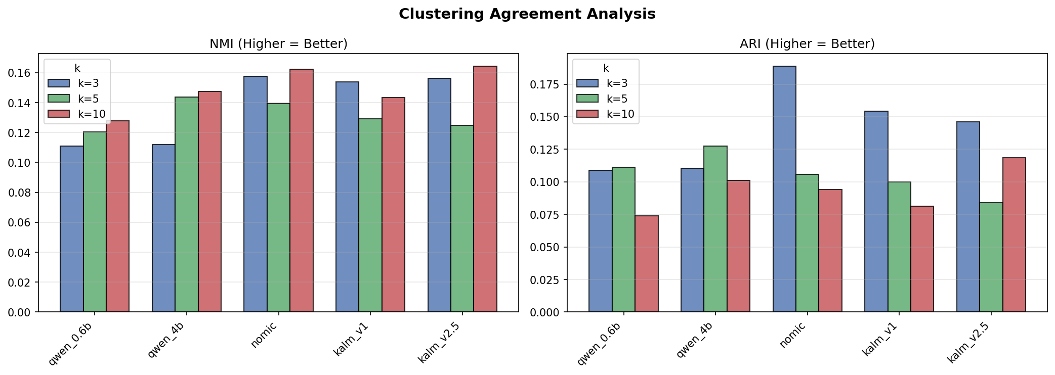
NMI and ARI between clustering algorithms for each model, broken out by k. Higher = algorithms agree more.
| Model | NMI (avg) | ARI (avg) |
|---|---|---|
qwen_0.6b | 0.120 | 0.098 |
qwen_4b | 0.134 | 0.113 |
nomic | 0.153 | 0.130 |
kalm_v1 | 0.142 | 0.112 |
kalm_v2.5 | 0.148 | 0.116 |
nomic leads — somewhat paradoxically given its hubness score. When the space is compressed and dominated by a few hubs, clustering algorithms may actually agree more because they’re all gravitating toward the same dominant regions.
3.2 Bootstrap Stability
We resample 80 % of the data 100 times and re-cluster, then measure the average ARI between original and resampled assignments:
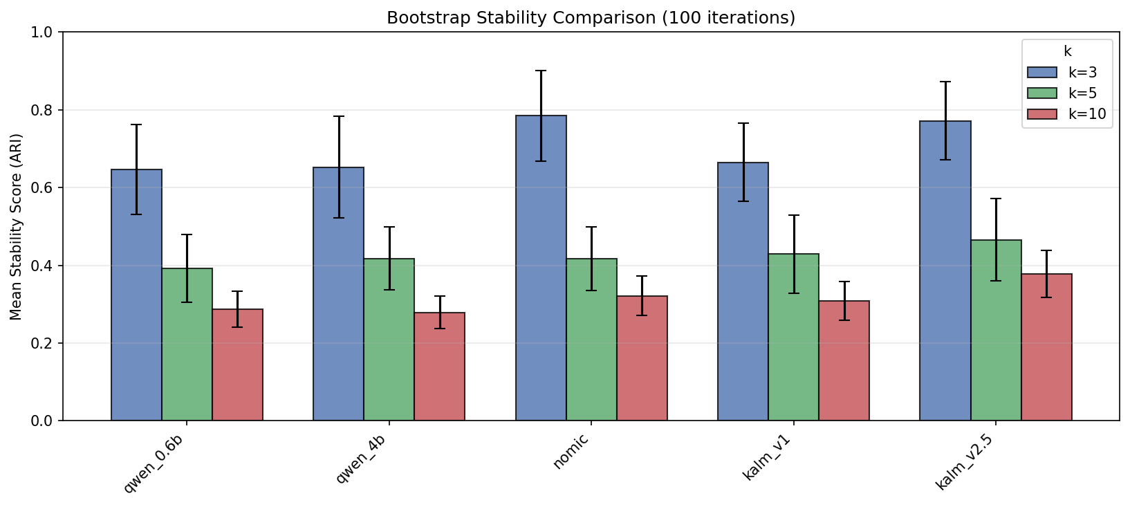
Bootstrap stability (ARI between original and resampled cluster assignments) for each model and k. Higher = more reproducible clusters.
| Model | Stability (avg across k) |
|---|---|
qwen_0.6b | 0.433 |
qwen_4b | 0.452 |
nomic | 0.513 |
kalm_v1 | 0.476 |
kalm_v2.5 | 0.532 |
kalm_v2.5’s extremely tight space (all points near each other) makes clusters trivially reproducible — any resample looks like any other. Stability here may be measuring compression rather than meaningful structure.
Step 4 — Classification (Ground Truth)
We now bring in ground-truth labels and test five classifiers with 5-fold cross-validation, all preceded by L2 normalisation. The task is three-class: hate_only vs misogyny_only vs no_bias.
Primary metric: macro-F1 (weights each class equally regardless of support).
| Model | Best F1 | Mean F1 | Best Classifier |
|---|---|---|---|
kalm_v1 | 0.378 | 0.338 | Logistic Regression |
qwen_0.6b | 0.346 | 0.315 | Logistic Regression |
qwen_4b | 0.345 | 0.321 | Logistic Regression |
kalm_v2.5 | 0.331 | 0.286 | Logistic Regression |
nomic | 0.310 | 0.292 | Gradient Boosting |
kalm_v1 wins clearly, and simple Logistic Regression beats more complex classifiers across the board. nomic — which led on every unsupervised metric — finishes last.
Step 5 — Does Any of It Correlate to Classification performance?
This is the central question: do the label-free metrics from Steps 2 and 3 predict the classification performance from Step 4?
5.1 Unsupervised Metrics vs. Classification F1
Each panel below plots one unsupervised metric against best macro-F1 across the five models. A solid red line indicates the linear fit is statistically significant (p < 0.05); a dashed grey line means it is not. The shaded band is the 95 % confidence interval of the fit.

Each unsupervised metric (x-axis) vs. best macro-F1 (y-axis) across five models. Solid red line = significant linear fit (p < 0.05); dashed grey = not significant. ρ is Spearman rank correlation.
The picture is striking. nomic is an outlier in almost every panel — it sits at the extreme of clustering NMI and ARI while landing at the bottom of F1. The Spearman correlations tell the story:
| Metric | Direction | ρ | p | Aligned? |
|---|---|---|---|---|
| Clustering ARI | higher = better | −0.90 | 0.04 | ✗ misaligned |
| NP — t-SNE | higher = better | −0.82 | 0.09 | ✗ misaligned |
| Clustering NMI | higher = better | −0.70 | 0.19 | ✗ misaligned |
| Bootstrap Stability | higher = better | −0.60 | 0.29 | ✗ misaligned |
| Similarity Std | lower = better | +0.60 | 0.29 | ✗ misaligned |
| Hubs Ratio | lower = better | −0.50 | 0.39 | ✓ aligned |
| Anti-Hubs Ratio | lower = better | −0.50 | 0.39 | ✓ aligned |
| Hubness Skewness | lower = better | −0.40 | 0.51 | ✓ aligned |
Only the hubness family (skewness, hubs ratio, anti-hubs ratio) points in the right direction, and none of the correlations survive a significance threshold — a consequence of having only five data points. The one result that does reach significance (Clustering ARI, p = 0.04) is the most counterintuitive: higher clustering agreement predicts lower F1. The mechanism is the compressed-space trap described in Section 3: nomic’s tight geometry forces clustering algorithms to trivially agree, inflating ARI while crushing discriminative power.
5.2 The Full Cross-Metric Picture

Normalised scores across all metrics (0 = worst, 1 = best per metric). Each row is one model; each column one metric. A model that was universally good would show a solid green row.
No row is uniformly green. kalm_v1 wins F1 and Hubs %, but scores poorly on every clustering and stability metric. nomic dominates NMI, ARI, and t-SNE neighbourhood preservation, yet finishes last on F1. The heatmap makes the core finding visible at a glance: the metric landscape is fragmented, and no label-free signal reliably identifies the best model for downstream use.
5.3 Rankings per Metric
Rank 1 = best, rank 5 = worst across all metrics:
| Model | F1 | Hub Skew | Hubs % | Anti-Hubs % | NMI | ARI | Stability |
|---|---|---|---|---|---|---|---|
kalm_v1 | 1 | 4 | 1 | 2 | 4 | 4 | 4 |
qwen_0.6b | 2 | 1 | 4 | 1 | 5 | 5 | 5 |
qwen_4b | 3 | 2 | 2 | 1 | 3 | 3 | 3 |
kalm_v2.5 | 4 | 3 | 5 | 4 | 2 | 2 | 1 |
nomic | 5 | 5 | 3 | 3 | 1 | 1 | 2 |
No column of ranks matches the F1 column. The closest alignment is the hubness family, but even there the correspondence is imperfect — kalm_v1 ranks 4th on hubness skewness yet 1st on F1.
5.4 Does Embedding Dimension Help?
A natural question is whether simply using a larger embedding (more dimensions) improves downstream quality, or whether it is a proxy for some underlying geometric property.

Embedding dimension vs. best F1, hubness skewness, clustering NMI, and bootstrap stability. Solid red line = significant fit; dashed grey = not significant. ρ is Spearman rank correlation.
The trends are weak and contradictory. Higher dimension is weakly associated with lower hubness skewness (a geometric improvement), but also with lower clustering NMI and stability (worse unsupervised structure). The F1 panel shows no discernible trend at all. Crucially, no effect reaches p < 0.05 — with only five models spanning 768–2 560 dimensions, the sample is far too small to draw conclusions about the role of dimensionality.
Conclusions
What we found
Similarity saturation hurts — and you can see it.
kalm_v2.5andnomiccompress embeddings into a narrow high-similarity band (std 0.02–0.04). The projections show this as a dense ball; the similarity histogram confirms it. This leaves little room for any distance-based discrimination.Hubness is a real and detectable problem.
nomic’s skewness of 3.01 is more than twice that of the best Qwen model. Hubness can be measured purely from the embedding matrix, with no labels, making it the most useful label-free quality filter we found.Clustering agreement misleads.
nomicleads on NMI and ARI but finishes last on downstream F1. A compressed space makes clustering algorithms trivially agree — but agreement on a bad clustering is worthless. HDBSCAN’s universal failure to find clusters in this dataset further undermined these metrics.kalm_v1wins downstream — but not because of outstanding geometry. It has mid-range hubness and mid-range clustering metrics. No label-free metric singled it out as the winner before running the classifier.Dimension size has no robust effect at n=5. With only five models, Spearman correlations are noisy and none reach significance.
What this means in practice
| Scenario | Recommendation |
|---|---|
| No labels available | Use hubness skewness as a rough quality filter. Skew > 2.5 is a red flag. |
| Few labels available | A small labelled probe set + logistic regression is more reliable than unsupervised metrics alone. |
| Comparing same-architecture models | Similarity std and hubness track relative quality reasonably well. |
| Comparing very different architectures | Unsupervised metrics can mislead. Always validate with at least a small downstream probe. |
Limitations
- Small dataset (n = 450) and few models (n = 5) limit statistical power.
- The classification task uses only three of the five original classes.
- HDBSCAN’s failure to cluster may be dataset-specific.
- 2-D projections preserve only 12–40 % of true neighbourhood structure — treat them as orientation, not evidence.
Appendix: Metric Quick Reference
| Metric | Symbol | Range | Better |
|---|---|---|---|
| Cosine similarity mean | (\mu_{\cos}) | [−1, 1] | — (context-dependent) |
| Cosine similarity std | (\sigma_{\cos}) | [0, 1] | Higher (more spread) |
| Hubness skewness | (S_k) | [0, ∞) | Lower |
| Hubs ratio | — | [0, 1] | Lower |
| Anti-hubs ratio | — | [0, 1] | Lower |
| Clustering NMI | NMI | [0, 1] | Higher |
| Clustering ARI | ARI | [−1, 1] | Higher |
| Bootstrap stability | — | [0, 1] | Higher |
| Macro F1 | (F_1^{\text{macro}}) | [0, 1] | Higher |